
ADP
Well-known member
- Joined
- Jul 16, 2015
- Messages
- 691
Was the cost of this project disclosed?
 ).
).It probably helped that he'd just done the Top Carve and was very happy with it and in a very good mood. (Cheers Florian

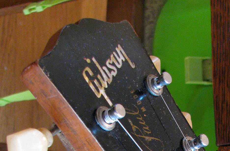
That is the Ozzy version dot. Silkscreen Les Paul Model position is nice. Sometimes those got a little too close to the Gibson logo and those look spatially odd to me.sorry so late. Here's my 1956 logo with dot placement:


 great pix
I like regular brown or dark back gold tops better I think. It’s a nice contrast to have to the gold in my opinion.Florian said it wouldn't be a problem.
But he said we should discuss it further when the time comes.
I'd still love to know what you all prefer and your thoughts on the Gold Back?
 makes the back look a bit darker than it is, but all gold would not make the top pop as much I think.

That looks legit!
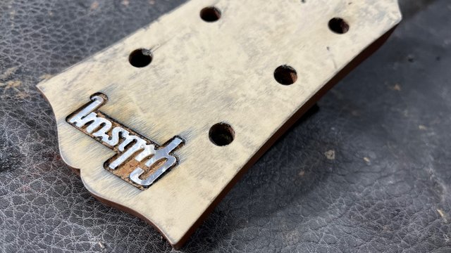
If I were spending the dough to do all this work, I'd put on a new veneer and locate the logo lower.Is Florian removing the old headstock veneer or just filling in the hole from the old Gibson logo? I am guessing he is just filling it in from the procedure so far.
So this is interesting. Steve, looks like the dot on your i is lower than the modern placement but slightly higher than the 54. And Wilko's 56 is higher again.Here's the headstock on my Historic that Gord Miller did for me in 2009. You will never regret fixing this detail.
Hey Gary, it's not about needing reassurance. My mind was made up long ago. I was just really interested in everyone's opinion because as far as I know the thinking behind the all Gold finish was to market the guitar as like the best of the best, it's all Gold!!!I think the consensus here is dark back ..how many times to you need reassurance
 guitarpoint.de


